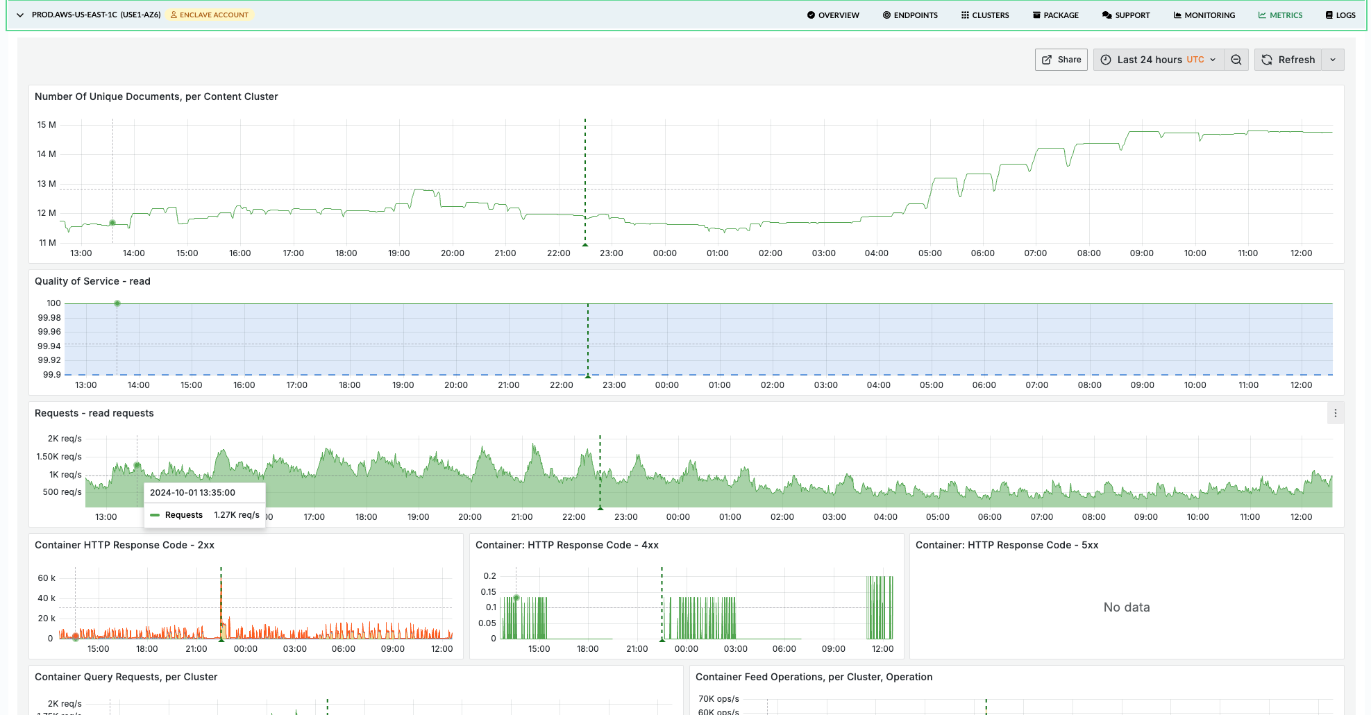
The Vespa Cloud Console has dashboards for insight into performance metrics, use the METRICS tab in the application zone view.
These metrics can also be pulled into external monitoring tools using the Prometheus metrics API.
The Vespa Cloud metrics dashboard
The Vespa Cloud metrics dashboard (the METRICS tab in the application zone view) is organized around a symptom → layer → resource workflow, so an investigation that starts from "latency is up" can land on "this specific layer is the bottleneck" without scanning every chart.
Tabs and filters

The dashboard is organized into multiple tabs:
| Tab | What it shows | When to use it |
|---|---|---|
| Overview | Health indicators, request rates, QoS, latency summary, HTTP status codes, resource utilization | Daily health check, first stop during incidents |
| Query | Container- and content-node query latency, per-rank-profile breakdown, match/docsum executors | Investigating read latency, query quality issues |
| Feed | Feed operation rates and latency at each layer, feed blocking | Investigating write latency or throughput issues |
| Nearest Neighbor Search | NNS distance computations, visit efficiency | Tuning HNSW parameters (hidden when not in use) |
| Content Node | Document counts, Proton resource usage, executor utilization, maintenance jobs | Deep investigation of search engine internals |
| Resources | CPU, memory, disk, GPU, JVM, thread pools | Sizing and scaling decisions |
| Health | Cluster state, data consistency, restarts, reindexing, resource limits | Stability monitoring, post-incident review |
| Autoscaling: Content | Per content cluster: CPU peak vs. ideal load, the query/write mix and query-growth that move the ideal target, load adjustment, active nodes, rescale actions | Understanding why and by how much a content cluster is being resized |
| Autoscaling: Container | The same set of panels for each container cluster | Understanding why and by how much a container cluster is being resized |
| Metric Reference | Alphabetical index of every metric referenced by the dashboard, with the tab(s) each one appears on | Looking up where a specific metric is graphed (browser Ctrl+F) |
| Explore | Ad-hoc: plot any metric, aggregated per cluster (optionally per host) | A quick look at a metric not covered by the curated tabs |
Filters at the top apply across all tabs:
- Cluster — limit metrics to specific clusters
- Per host metrics — toggle between aggregated cluster view and per-node breakdown
- Rank Profile — filter per-rank-profile panels on the Query tab (defaults to "All")
Query, Feed, Content Node, Resources, Health, and both Autoscaling tabs group metrics per cluster — you see all metrics for one cluster before scrolling to the next. Container metrics are grouped per container cluster, content metrics per content cluster.
Annotations
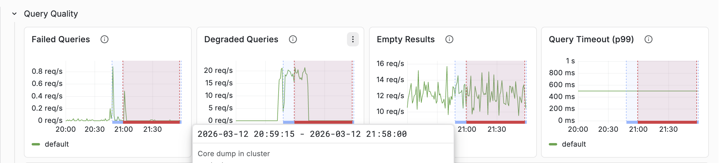
Annotations are vertical lines drawn on every chart that mark operational events. When a latency or throughput anomaly lines up with an annotation, you get the context for the change without having to infer it from the graph alone.
| Annotation | Triggered by | Why it matters |
|---|---|---|
| Feed blocked in cluster | A content node crosses its disk/memory feed-block limit | Writes are paused cluster-wide until remediated |
| Vespa upgrade | A new Vespa version is rolled out | Brief rolling-restart latency spikes are expected around this marker |
| OS upgrade | Nodes start reporting a new host OS version | Nodes are rebuilt on the new OS, so brief per-node capacity dips are expected |
| Data migration | Bucket merges pending exceed a threshold | Explains elevated CPU/IO and latency during redistribution |
| Document re-indexing | A reindexing job is running | Explains elevated CPU and search-side load |
| Auto-scaling | The autoscaler changed the cluster shape | Brief capacity drop during reshuffle |
| Service restart | delta(sentinel_totalRestarts[10m]) > 0 — a Vespa service process restarted on one or more nodes |
Unexpected restarts usually indicate a crash, OOM, or forced stop; outside of planned upgrades these are always worth investigating |
| Core dump | delta(coredumps_processed[1h]) > 0 — a process core-dumped |
Signals a crash; cross-reference with Service restart. Should be extremely rare |
Overview tab
The Overview tab is the fastest place to answer "is anything obviously broken?" and provides everything needed for daily monitoring at a glance.
Health Indicators

The Overview tab opens with a dedicated Health Indicators row — stat panels designed to surface stability and data-consistency issues at a glance. A row of green zeros is the signal to stop; a non-zero value tells you which tab to visit next.
| Indicator | What it counts | Healthy value |
|---|---|---|
| Core Dumps (1h) | Core dumps processed across all clusters in the last hour | 0 — any non-zero value is a crash to investigate |
| Restarts (1h) | Vespa service restarts across all clusters in the last hour | 0 during steady state; brief spikes are normal during upgrades |
| Feed Blocked | Nodes currently above a feed-block resource limit | 0 — non-zero means writes are being rejected cluster-wide |
| Content: Groups/Nodes Down | Content groups with at least one node down | 0 during steady state. 1 group down is normal during rolling restarts or maintenance; 2 or more should be investigated |
| Container: Services Down | Active container nodes where some service isn't running | 0 during steady state; brief spikes during deployments are expected |
| Buckets Out of Sync (%) | Percentage of data buckets not yet replicated/consistent, per content cluster (green = synced, blue = rebalancing) | 0% at steady state. Non-zero is normal and expected during scaling, node replacement, upgrades, and recovery, and should converge back to 0 — investigate only if it persists with no such event or fails to converge. See the Health tab for the trend |
QoS and latency overview
QoS (Quality of Service) shows the percentage of successful requests. Read and write QoS are shown separately; a healthy application should be above 99.9%. If QoS drops, consult the HTTP Response Code Reference row (collapsed by default) for a table explaining every observed status code and its meaning in Vespa context. 4xx responses are client errors; 5xx responses are server errors and should be investigated immediately.
Latency summary separates query and feed latency into read and write rows. Compare averages with p99 — a large gap indicates tail latency that won't show up in averages. As a rule of thumb, if p99 is more than 5× the average, investigate the tail.
Resource utilization
CPU, memory, and disk are shown in two rows — one for content clusters and one for container clusters — because the two cluster types have different expectations. Each cluster is drawn in its own colour so several clusters are easy to tell apart.
- Content — high utilization is a concern on content nodes: CPU drives query and write latency, and memory and disk approach the feed-block limits. Concern lines are drawn at CPU 70% / 85%, memory 80% / 90%, and disk 70% / 80%.
- Container — the stateless tier. CPU saturation still matters (lines at 70% / 85%) and disk is usually low, but memory is expected to run high (JVM heap, direct/native buffers, caches) and a high value is not a concern by itself, so the container memory panel draws no threshold lines.
Query tab
When query latency increases, the Query tab helps find the cause layer-by-layer. Metrics are grouped per container cluster (for container-level metrics) and per content cluster (for content-node metrics).
A query flows through multiple layers, each with its own latency metric:
Client
  → HTTP Read Latency             (end-to-end including network I/O)
    → Query Container Latency     (time in the container itself)
      → Query Latency             (container-observed total, excluding HTTP overhead)
        → Search Protocol Latency (time on each content node)
          → Rank Profile Latency  (per rank-profile breakdown)
Container-level metrics
Start with the Query Rate & Latency row:
- Did QPS increase? More queries means more load.
- Which latency metric increased?
- Query Latency — container level, includes dispatch to content nodes
- HTTP Read Latency — includes HTTP I/O overhead
- Search Protocol Latency — content node execution only
If HTTP latency is much higher than query latency, the bottleneck is network or payload size. If search protocol latency dominates, the bottleneck is on the content nodes.
The Query Quality row shows:
- Failed queries — actual errors. Should be near zero.
- Degraded queries — queries that were soft-doomed (ran out of time during matching). These return partial results.
- Empty results — queries returning zero hits. A sudden increase may indicate an indexing problem or a query change.
Rank profile metrics
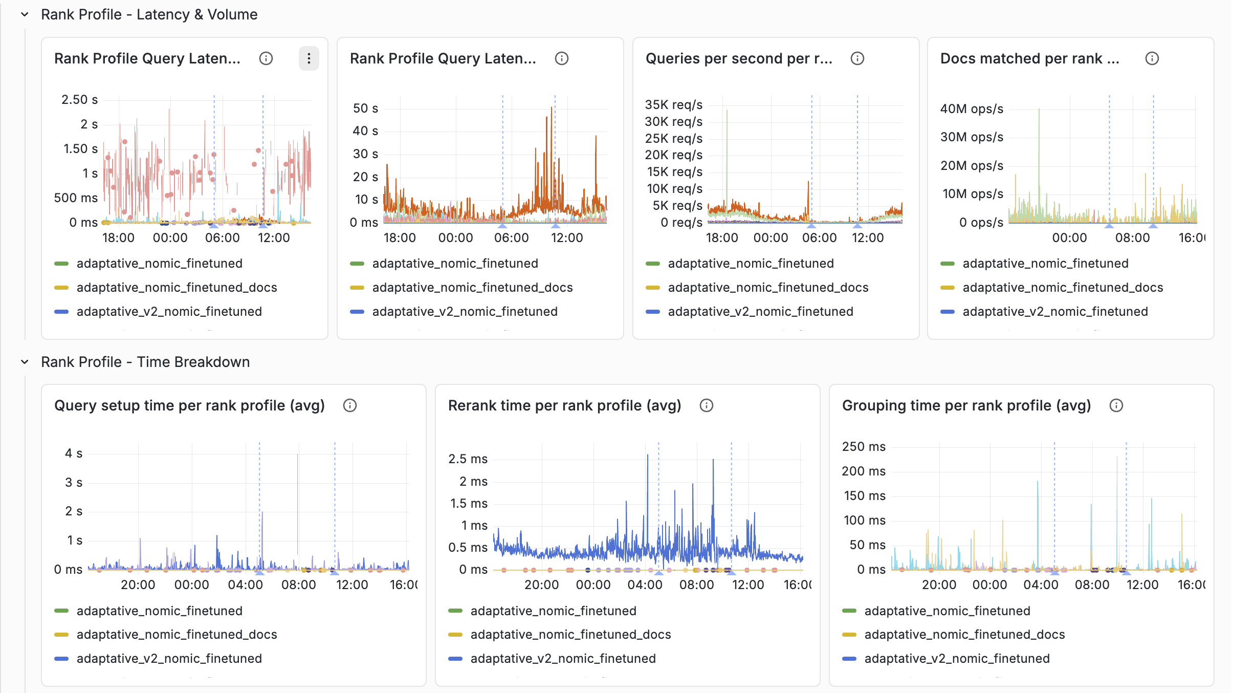
The Query tab groups per-rank-profile metrics into four sub-rows, all filterable by the Rank Profile dropdown:
- Rank Profile — Latency & Volume — query latency (avg and max), QPS per profile, and raw docs matched per profile
- Rank Profile — Time Breakdown — setup time, rerank time, and grouping time, each shown as avg plus peak so you can tell whether a profile has steady-state cost or occasional cost spikes
- Rank Profile — Quality — docs matched per query, soft-doom factor, and soft-doomed queries. These tell you when a profile is overrunning its time budget.
- Rank Profile — Query Distribution — QPS split by content group, which helps spot uneven routing
Things to look for:
- Which rank profile has the highest latency?
- Are soft-doomed queries concentrated on a specific rank profile?
- Is the peak for rerank or grouping time much higher than the average? That often points to a specific second-phase or grouping expression that's expensive only on some queries.
- Did docs matched per query grow? More documents matched means more ranking work.
See Latency tracking below for a worked example, and the rank profiles documentation for background.
Match and Docsum executor panels
The Query tab also includes Match Executor and Docsum Executor sub-rows (queue size + accepted rate) so you can see whether the content-node thread pools feeding the query and summary paths are saturated. These are not attributable to a rank profile, but often explain tail-latency spikes that aren't visible in rank-profile metrics.
Feed tab
When feed latency increases or throughput drops, the Feed tab shows where in the write path the slowdown occurs. A write operation flows through:
Client
  → HTTP Write Latency            (end-to-end)
    → Container Feed Latency      (document processing chains, embedders)
      → Distributor Latency       (routing based on bucket distribution)
        → Content: Storage Latency(persistence, per document replica)
          → Commit Latency        (transaction log)
Start from the top and find where latency increases. If container feed latency is normal but HTTP write latency is high, the bottleneck is network/payload. If distributor latency is high, check for node state issues in the Health tab. If storage latency is high, check disk I/O in the Resources tab.
Typical healthy values
- Feed latency: 1–50 ms for puts/updates is typical; spikes during maintenance are normal
- Distributor failures: zero — non-zero indicates node state issues
- HTTP API failures: near zero
- Feed blocked: always zero
Feed blocked
Feed Blocked is the most critical feed metric. When a content node exceeds its
disk or memory resource limit, feeding is paused for
the entire cluster. HTTP clients receive 507 Insufficient Storage.
If feed is being blocked:
- Check Health > Feed Resource Limits for which resource is near the limit.
- Check the Resources tab for the specific nodes causing pressure.
- Add nodes to the content cluster (always add, don't resize — data auto-redistributes).
The Health tab includes a Resource Limits Reference panel explaining the default limits, the blocking mechanism, and how to remediate.
Nearest Neighbor Search tab
This tab only appears when the application uses approximate nearest neighbor search — it is automatically hidden when no NNS distance computations are detected. All metrics are grouped per content cluster, with a per-host toggle.
Vespa supports two NNS modes:
- Approximate NNS — uses an HNSW graph index to find neighbors efficiently without checking every document that passes the filter. Generally fast, but may miss some true nearest neighbors.
- Exact NNS — brute-force search computing distance to every document that passes the filter. Accurate but expensive.
Approximate NNS works well in most cases, but is less suited when the filter is very restrictive,
as that makes the graph hard to navigate. For a restrictive filter, exact NNS works well since only
few documents have to be checked. Vespa automatically falls back to exact NNS when the filter hit
ratio is below the approximate-threshold (default 0.02). In this border region, the
filter-first heuristic ("Acorn-1") controlled by filter-first-threshold can avoid the
latency spikes of classical HNSW.
Overview and detail metrics
- Exact NNS Distance Computation Ratio — fraction of distance computations
using brute-force search. Highly dependent on incoming queries. High values (above ~50%)
could indicate that
approximate-thresholdis too high. - Approximate NNS Visit Efficiency — ratio of graph nodes visited to
distances computed. Lower is more efficient. Values above 1.0 show the filter-first heuristic
("Acorn-1") is in use, and reflect the hit ratios of incoming queries' filters — the higher
the value, the lower the hit ratios. Values outside [1.0, 20.0] could indicate
filter-first-explorationis too high. - Distances Computed — rate of distance calculations. Higher means more CPU used for NNS; unoptimized HNSW parameters can cause sudden spikes.
- Nodes Visited — rate of HNSW graph node visits. For classical HNSW this equals the number of computed distances; the filter-first heuristic visits more nodes than distances it computes.
Query rate
The query rate is split into the queries that perform an approximate NNS and the rest (which includes queries that fall back to exact NNS), so the two add up to the total. This shows at a glance how much of the traffic exercises the HNSW index.
Query latency breakdown
Latency is decomposed so you can tell where time is being spent. The total splits into setup and matching, and setup splits again to isolate approximate NNS:
- Query Latency — total time matching and ranking a query (average and max).
- Query Setup Time — setting up and tearing down queries (average and max). Includes filter computation and approximate NNS.
- Query Matching Time — the matching process (average and max). This is where exact NNS happens. Derived as Query Latency − Query Setup Time.
- Query Setup Time Without Approximate NNS Time — setup minus approximate NNS, i.e. mostly filter computation.
- Query Approximate NNS Time — time spent on approximate NNS, averaged only over the queries that perform one.
Timeouts
- ANN Timeout Rate — rate of queries that terminated an approximate NNS early because they hit the ANN time budget.
- Soft Timeout Rate — rate of queries that terminated early because they hit the soft timeout.
How to act on high latencies
- Check whether the system is simply overloaded — look at Query Rate and Thread Pool – Match Utilization.
- Identify the source — approximate or exact NNS?
- Query Approximate NNS Time high — likely unoptimized HNSW parameters; see the tuning parameters below. A query time budget is the safe way to experiment.
- Query Setup Time high without approximate NNS time being high — the filter computation is slow; restructuring the query could help.
- Query Matching Time high — this is where exact NNS happens; indicates
approximate-thresholdis too large, making Vespa fall back to exact NNS too early.
HNSW parameter tuning
Besides targetHits, several
rank-profile parameters
(each with a query-parameter
counterpart) tune HNSW behaviour:
approximate-threshold(default 0.02) — filter hit ratio below which a query falls back to exact NNS. If set wrong, queries crossing it can spike in latency.filter-first-threshold(default 0.2) — filter hit ratio below which the filter is checked before a distance computation. Improves latency at low hit ratios but may reduce recall; set to 0.0 to disable the heuristic.filter-first-exploration(default 0.01) — how much of the graph the filter-first heuristic explores. Higher improves recall but worsens latency — increase with caution.exploration-slack(default 0.0) — an alternative to raisingtargetHitsfor better recall, at the cost of latency.post-filter-threshold,target-hits-max-adjustment-factor— configure post-filtering, useful for queries with high filter hit ratios.
The safe way to experiment is the
ranking.matching.anntimebudget
query parameter, which caps the time spent on approximate NNS so latency cannot explode while you tune.
Content Node tab
The Content Node tab shows internals of the Proton search engine running on each content node. All metrics are grouped per content cluster.
Documents
- Total — all documents in the database (including removed)
- Ready — documents available for search
- Active — primary copies that should be searchable on this node
- Removed — tombstones pending garbage collection
Proton resource usage
Disk and memory usage from Proton's internal accounting. This is distinct from node-level metrics in the Resources tab — these are the values Vespa uses for feed-blocking decisions.
By default each panel shows one line per content cluster. Enable the Per host metrics toggle to break disk and memory down per node — useful for spotting a single node approaching its feed-block limit while the cluster view still looks healthy, for example when data is unevenly distributed across nodes.
Executor utilization
Proton uses several thread pools (executors):
- Match — executes queries. Directly impacts query latency.
- Shared — handles background tasks like flush and compaction.
- Proton — internal coordination tasks.
- Field writer — writes attribute and index data during feeding. Saturation directly impacts feed throughput.
Typical healthy values:
- Utilization below 0.8 (80%) — sustained values above this are a bottleneck
- Field writer saturation well below 1.0
- Queue sizes near zero during steady state
The dashboard renders avg as a solid green line and max as a dashed yellow line, making it easy to spot whether the maximum tracks the average or has concerning spikes.
Maintenance jobs
Proton runs background maintenance jobs that manage data structures. The dashboard includes a reference panel (collapsed) explaining each job and its resource impact:
| Job | Resource impact |
|---|---|
| Attribute Flush | Low |
| Memory Index Flush | Moderate |
| Disk Index Fusion | High — temporary 2× disk usage |
| Document Store Compaction | High — holds file in memory |
| Bucket Move | High — competes with feeding |
| LID-Space Compaction | Moderate |
Latency spikes that correlate with active maintenance are expected but may indicate the cluster needs more headroom.
Resources tab
The Resources tab is the primary tool for sizing decisions. Node-level resources (CPU, memory, disk) are grouped per cluster. Container-specific metrics (JVM, thread pools, GPU, network) are grouped per container cluster.
Typical healthy values
| Resource | Healthy | Concerning | Action needed |
|---|---|---|---|
| CPU | < 70% | 70–85% | > 85% sustained |
| CPU IOWait | < 5% | 5–10% | > 10% (I/O bottleneck) |
| Memory | < 70% | 70–80% | Approaching feed-block limit |
| Disk | < 70% | 70–80% | Approaching feed-block limit |
| JVM GC Overhead | < 5% | 5–15% | > 15% (severe latency impact) |
| Threadpool utilization | < 70% | 70–90% | Rejected tasks = requests dropped |
Content nodes need extra headroom because maintenance jobs (especially disk index fusion) temporarily increase resource usage.
Container thread pools

Which thread pools exist on a container depends on which elements are configured
in services.xml:
| Thread pool | Present when |
|---|---|
default-handler-common | Always (handler executor used by anything without its own pool) |
search-handler | <search> element is present |
feedapi-handler | <document-api> element is present |
To keep the dashboard free of empty panels, the Resources tab contains three threadpool rows — one per container configuration case — and each row repeats per container cluster that falls into that case:
- Container Thread Pools (search + document-api) — clusters with both pools
- Container Thread Pools (search only) — clusters with
<search>but no feed API - Container Thread Pools (document-api only) — feed-only clusters
Classification is automatic: hidden variables derive the cluster list per case, so only relevant rows render for a given deployment. Each pool gets three panels — Utilization, Work Queue Size, Work Queue Utilization — with avg as a solid green line and max as a dashed yellow line.
- Utilization — active threads as percentage of pool size
- Work queue size — tasks waiting for a thread. The default pool uses a synchronous queue (capacity 0), so there is no buffering — if no thread is available, the task is rejected.
- Queue utilization — percentage of configured queue capacity used (only meaningful for thread pools with bounded queues)
JVM memory breakdown
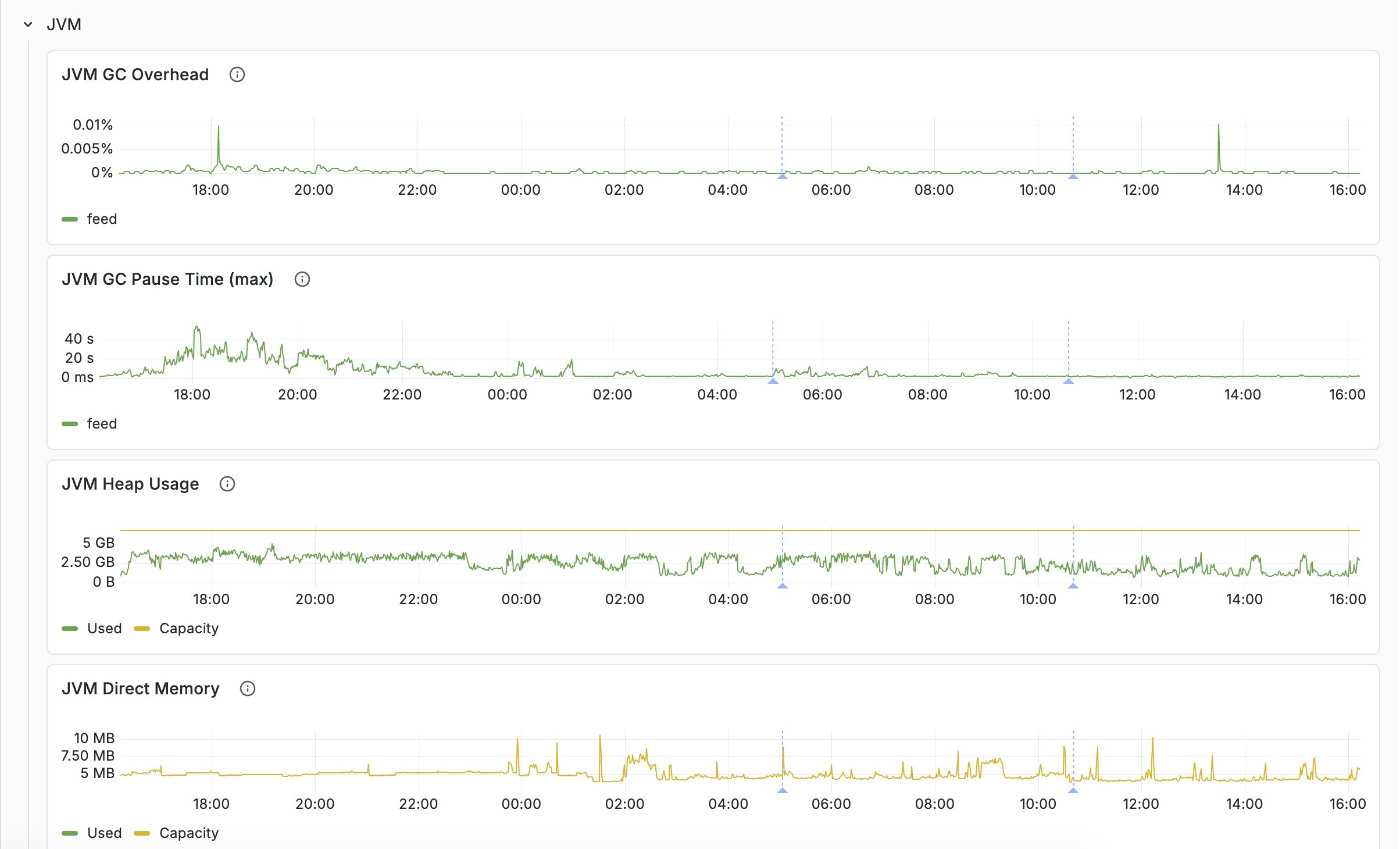
The Resources tab's JVM row separates the three layers of container memory:
- JVM Heap Usage — Java objects (searchers, document processors, caches)
- JVM Direct Memory — NIO buffers, Netty pools
- JVM Native Memory — JNI allocations, including ONNX embedder working memory and — if configured — a local LLM's KV cache and compute buffers
When overall node memory is high but heap and direct look normal, the native layer is usually the answer. This is common on container nodes running embedder or local-LLM components: model weights are memory-mapped and only partially resident, but KV cache and compute buffers are allocated upfront as native memory.
Health tab
The Health tab tracks cluster stability and data consistency, grouped per content cluster.
Cluster state
Nodes are distributed across states: up (serving), down (unreachable), initializing (starting up), maintenance (temporarily out), retired (being removed). During normal operation: all up, zero down. See content node states.
Data consistency
- Buckets Out of Sync (%) — percentage of data buckets not yet replicated/consistent. Shown as a time series here and as an at-a-glance stat on the Overview tab.
- Merge Pending — bucket merge operations queued. High during data redistribution.
This is a progress signal, not a severity gauge — so the panels carry no green/orange/red thresholds. It is expected to be non-zero, often high, during normal operations: scaling resizes, node replacement, rolling upgrades, and recovery all redistribute data, and a freshly added node can be close to 100% out of sync until it receives its share. The value alone does not indicate a problem; what matters is its behaviour over time. Read it alongside the Auto-scaling, Vespa upgrade, and Data migration annotations: a rise that lines up with one of those events and then converges back to zero is healthy. Investigate only when it is non-zero with no corresponding event, or when it fails to converge long after the triggering event. (The Overview stat is coloured neutrally — green when synced, blue while rebalancing — for the same reason.)
Stability
- Service Restarts — cumulative restarts per cluster. An increase indicates a process crash.
- Core Dumps — should always be zero.
Both signals surface in three complementary ways: as per-cluster time series on this tab (for historical context), as at-a-glance counters in the Health Indicators row on the Overview tab, and as Service restart/Core dump annotations drawn as vertical lines on every chart.
Feed Resource Limits
Shows memory and disk utilization vs. configured limits. When utilization exceeds the limit, feeding is blocked. The dashboard includes a Resource Limits Reference panel (collapsed) explaining the default limits (disk 80%, memory 80%), the blocking mechanism, and what to do about it.
Autoscaling tabs
The Autoscaling: Content and Autoscaling: Container tabs explain why autoscaling resizes a cluster and roughly how big the change is. They are most useful when a resize surprised you, or when you are deciding whether to enable autoscaling in the first place — the panels render even while autoscaling is disabled, so you can see what it would do. Each tab repeats its set of panels once per cluster (content clusters on the first tab, container clusters on the second).
The autoscaler compares each cluster's peak load (the busiest point in the recent window) against an ideal load target it maintains per resource. The ideal target sits intentionally below 100% — it already reserves headroom for traffic growth and for absorbing traffic if another zone becomes unavailable. Peak above ideal pushes the cluster to scale up; peak held comfortably below ideal scales it down.
Of the per-resource targets the autoscaler tracks, only CPU peak and ideal are exported to the Vespa Cloud metric tier (memory and disk are still considered internally; their targets simply aren't published), so these tabs focus on CPU.
| Panel | What it shows |
|---|---|
| CPU load — peak vs ideal | Peak observed CPU load against the autoscaler's ideal CPU target. The gap between them is the scale-up (or scale-down) pressure, and its size drives how big the resize is. |
| Query vs write rate — CPU mix driver | The query and write rates side by side. The ideal CPU target is a blend of a query-oriented and a write-oriented target, weighted by where CPU is spent — so a shift in this mix moves the ideal line even at steady total load. |
| Query growth (rate vs 3h average) | Query rate divided by its own trailing 3-hour average. Above 1.0 means traffic is trending up, which makes the autoscaler reserve growth headroom (lowering the ideal CPU target) and can trigger a scale-up even when current load looks flat. A direction indicator, not an exact value. |
| CPU load adjustment (peak / ideal) | The central signal: peak CPU divided by ideal CPU. 1.0 means ideally scaled for CPU; above 1.0 is under-provisioned, below 1.0 over-provisioned. The value roughly sets the size of the next resize (1.5 ≈ needs about 50% more CPU). |
| Active nodes | Active node count with the non-active fraction overlaid. Step changes mark completed resizes; a non-zero non-active fraction means a change is in progress — for content clusters this includes data redistribution. |
| Autoscaling actions | Rescale decisions in the selected window. Line each bump up with the node-count and load-adjustment panels to see what triggered it. These events also appear as the Auto-scaling annotation on every chart. |
Reading the "why it scaled when load looks flat" case: the ideal target moves. When the query/write mix shifts toward writes, when query growth rises above 1.0, or when the autoscaler reserves capacity so the cluster can absorb traffic from a zone that becomes unavailable, the ideal CPU target drops — and a scale-up can follow at steady observed load. Watching the ideal line, not just peak, is the key. The zone-failover reservation is not directly graphed, so if the ideal line moves while the query/write mix, query growth, and node count all look flat, that reservation is the likely cause.
Content clusters scale on CPU, memory and disk, and a resize can change node count, group count, or node size; because data must be redistributed, the non-active fraction stays above zero until rebalancing completes. Container clusters are CPU-driven and scale by node count only — with no data to move, their resizes complete quickly.
Metric Reference tab
The Metric Reference tab is a single text panel listing every Prometheus-exported metric
currently queried by the dashboard, paired with the tab(s) it is graphed on and a
Per host column marking the metrics you can break down per node with the
Per host metrics toggle. Open the tab
and use the browser’s find shortcut (Ctrl+F / Cmd+F) to look up where a metric appears.
The list is alphabetical and includes the aggregator suffix (_max,
_sum, _count, _rate, _average,
_min, _95percentile, _99percentile); some metrics
appear on multiple tabs.
The table is generated from the dashboard JSON, so it stays in sync with the panels. No queries, panels, or filters live on this tab beyond the reference itself.
Explore tab
An ad-hoc explorer for metrics not covered by the curated tabs. Pick a metric from the
Explore metric dropdown and an aggregation from
Explore aggregation (sum / avg / max /
min); the panel plots the selected metric aggregated per cluster, with Vespa’s
admin components (cluster controllers and logserver) excluded. Toggle
Per host metrics to break it down per node when the metric carries a
host label.
It is deliberately generic — the Y-axis unit is not metric-specific and the same aggregation is applied to whatever metric you pick. Use the Metric Reference tab or the metrics reference to find metric names; for curated, unit-correct charts prefer the dedicated tabs.
Common workflows
"Our query latency increased"
- Overview: confirm the latency increase, check if QPS also changed.
- Query: which percentile increased most? (avg vs p95 vs p99)
- Query → Rank Profile: is it one query type or all?
- Resources: CPU, JVM GC overhead.
- Content Node: match executor utilization, queue sizes growing?
"Feed is slow / feed is blocked"
- Overview: check feed latency and feed operation rate.
- Feed: which layer shows increased latency?
- Health: is feed blocked? Check resource limits.
- Resources: disk and memory utilization, CPU IOWait.
- Content Node: field writer saturation, filestor queue, active maintenance jobs.
"Should we scale up?"
- Resources: identify the bottleneck resource.
- Content Node: check executor utilization (are we compute-bound?).
- Per host view: is load evenly distributed?
- Enable autoscaling or adjust resources in
services.xml. - See the benchmarking guide for systematic capacity testing.
Latency tracking
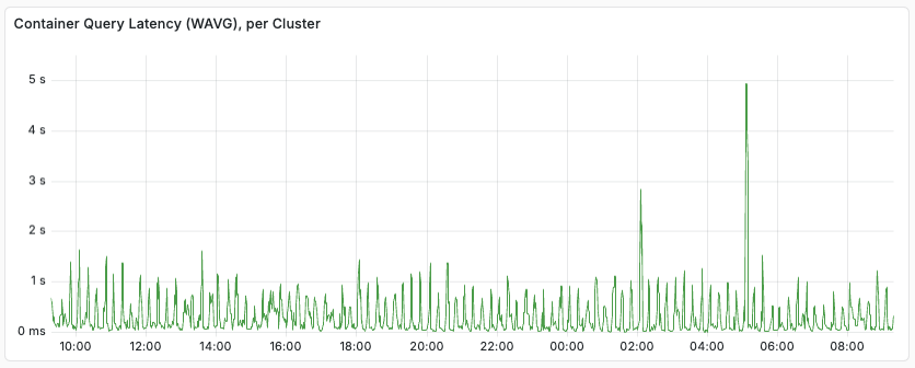
When monitoring latency in clusters with mixed loads, it is useful to use rank profiles to separate them. As an example, an application might have user queries mixed with agentic, batch-oriented queries. Tracking the Container-level query latencies might look like:
Using Content node level metrics, separated by ranking profile, we see:
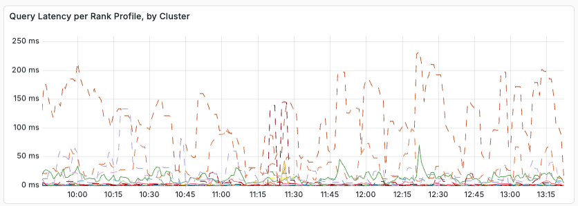
From this, we see that query latency varies with the rank profile used. Relevant metrics to export to your monitoring system include:
- content.proton.documentdb.matching.rank_profile.queries
- content.proton.documentdb.matching.rank_profile.docs_matched
- content.proton.documentdb.matching.rank_profile.query_latency
- content.proton.documentdb.matching.rank_profile.rerank_time
In short, when debugging latency, look for changes, per rank profile:
- Did the query rate increase?
- Did number of matched or ranked documents change?
The above metrics is a subset or the available metrics. It is a good idea to set a query profile per class of query, and in each query profile, select a distinct rank profile. With this, you can change the rank profile for a given query class by configuration only (no need to change the clients) - a good example is having a lightweight rank profile to use in overload situations. This makes it easier to track the individual query classes, per rank profile.
Exporting telemetry to your own backend
In addition to pulling metrics with the Prometheus metrics API, Vespa Cloud can push your application's metrics and logs to an external observability backend (OTLP, Google Cloud, …) — self-service telemetry export. Vespa Cloud runs a managed collector on your hosts that exports the data to the backend you configure. See Telemetry export.
This feature is available for Vespa Cloud Enclave only.
Prometheus metrics API
Prometheus metrics are found at $ENDPOINT/prometheus/v1/values:
$ curl -s --cert data-plane-public-cert.pem --key data-plane-private-key.pem \
  'https://b6718765.b68a1234.z.vespa-app.cloud/prometheus/v1/values'
The metrics can be fed into e.g. your Grafana Cloud or self-hosted Grafana instance. See the Vespa metrics documentation for more information.
Using Grafana
This section explains how to set up Grafana to consume Vespa metrics using the Prometheus API.
1. Prometheus configuration
Prometheus is configured using prometheus.yml, find sample config in
prometheus.
See prometheus-cloud.yml,
which is designed to be easy to set up with any Vespa Cloud instance.
Replace <Endpoint> and <SERVICE_NAME> with the endpoint
for the application and the service name, respectively.
In addition, the path to the private key and public cert
that is used for the data plane to the endpoint need to be provided -
refer to security.
Then, configure the Prometheus instance to use this configuration file.
The Prometheus instance will now start retrieving the metrics from Vespa Cloud.
If the Prometheus instance is used for multiple services,
append the target configuration for Vespa to scrape_configs.
2. Grafana configuration
Use the provisioning folder as a baseline for further configuration.
In the provisioning folder there are a few different files that all help for configuring Grafana locally.
These work as good examples of default configurations,
but the most important is the file named Vespa-Engine-Advanced-Metrics-External.json.
This is a default dashboard, based upon the metrics the Vespa team use to monitor performance.
Click the + button on the side and go to import. Upload the file to the Grafana instance. This should automatically load in the dashboard for usage. For now, it will not display any data as no data sources are configured yet.
3. Grafana Data Source
The Prometheus data source has to be added to the Grafana instance for the visualisation. Click the cog on the left and then "Data Sources". Click "Add data source" and choose Prometheus from the list. Add the URL for the Prometheus instance with appropriate bindings for connecting. The configuration for the bindings will depend on how the Prometheus instance is hosted. Once the configuration details have been entered, click Save & Test at the bottom and ensure that Grafana says "Data source is working".
To verify the data flow, navigate back to the Vespa Metrics dashboard by clicking the dashboard symbol on the left (4 blocks) and clicking manage and then click Vespa Metrics. Data should now appear in the Grafana dashboard. If no data shows up, edit one of the data sets and ensure that it has the right data source selected. The name of the data source the dashboard is expecting might be different from what your data source is named. If there is still no data appearing, it either means that the Vespa instance is not being used or that some part of the configuration is wrong.
Using AWS Cloudwatch
To pull metrics from your Vespa application into AWS Cloudwatch, refer to the metrics-emitter documentation for how to set up an AWS Lambda.
Alerting
The Vespa Grafana Terraform template provides a set of dashboards and alerts. If you are using a different monitoring service and want to set up an equivalent alert set, you can follow this table:
| Metric name | Threshold | Dimension aggregation |
|---|---|---|
| content_proton_resource_usage_disk_average | > 0.9 | max by(applicationId, clusterId, zone) |
| content_proton_resource_usage_memory_average | > 0.8 | max by(applicationId, zone, clusterId) |
| cpu_util | > 90 | max by(applicationId, zone, clusterId) |
| content_proton_resource_usage_feeding_blocked_last | >= 1 | N/A |
All metrics are from the default metric set. Metrics are using the naming scheme from the Prometheus metrics API. Dimension aggregation is optional, but reduces alerting noise - e.g. in the case where an entire cluster goes bad. It is recommended to filter all alerts on zones in the prod environment.
Prometheus Metrics Sample
Below is a sample request with sample response for prometheus metrics for a minimal application on Vespa Cloud:
$ curl -s --cert data-plane-public-cert.pem --key data-plane-private-key.pem \
  'https://b6718765.b68a1234.z.vespa-app.cloud/prometheus/v1/values'

...
jdisc_thread_pool_work_queue_size_min{threadpool="default-pool",zone="dev.aws-us-east-1c",applicationId="mytenant.myapp.default",serviceId="logserver-container",clusterId="admin/logserver",hostname="h97490a.dev.us-east-1c.aws.vespa-cloud.net",vespa_service="vespa_logserver_container",} 0.0 1733139324000
jdisc_thread_pool_work_queue_size_min{threadpool="default-handler-common",zone="dev.aws-us-east-1c",applicationId="mytenant.myapp.default",serviceId="logserver-container",clusterId="admin/logserver",hostname="h97490a.dev.us-east-1c.aws.vespa-cloud.net",vespa_service="vespa_logserver_container",} 0.0 1733139324000
# HELP content_proton_documentdb_matching_rank_profile_rerank_time_average
# TYPE content_proton_documentdb_matching_rank_profile_rerank_time_average untyped
content_proton_documentdb_matching_rank_profile_rerank_time_average{rankProfile="rank_albums",documenttype="music",zone="dev.aws-us-east-1c",applicationId="mytenant.myapp.default",serviceId="searchnode",clusterId="content/music",hostname="h104562a.dev.us-east-1c.aws.vespa-cloud.net",vespa_service="vespa_searchnode",} 0.0 1733139324000
content_proton_documentdb_matching_rank_profile_rerank_time_average{rankProfile="unranked",documenttype="music",zone="dev.aws-us-east-1c",applicationId="mytenant.myapp.default",serviceId="searchnode",clusterId="content/music",hostname="h104562a.dev.us-east-1c.aws.vespa-cloud.net",vespa_service="vespa_searchnode",} 0.0 1733139324000
content_proton_documentdb_matching_rank_profile_rerank_time_average{rankProfile="default",documenttype="music",zone="dev.aws-us-east-1c",applicationId="mytenant.myapp.default",serviceId="searchnode",clusterId="content/music",hostname="h104562a.dev.us-east-1c.aws.vespa-cloud.net",vespa_service="vespa_searchnode",} 0.0 1733139324000
...
Relevant labels include:
-
chainThis is the name on the search chain in the container that is used for a set of query requests. This is typically used to get separate metrics, such as latency and the number of queries for each chain over time. -
documenttypeThis is the name of the document type for which a set of queries are run in the content clusters. This is typically used to get separate content layer metrics, such as latency and the number of queries for each chain over time. -
groupIdThis is the id of the cluster group for which the metric measurement is done. This is typically used to get separate metrics aggregates per group in a content cluster. The label is most relevant for metrics from the content clusters running multiple content groups, see Content Cluster Elasticity. The value is in the format group 0, group 1, group 2, etc. -
rankProfileThis label is present for a subset of metrics from the content clusters, with names starting withcontent_proton_documentdb_matching_rank_profile_. The label is typically used in cases where you use multiple rank profiles and want to analyse performance differences between the different rank profiles, or to better understand certain types of performance issues and need to narrow down the candidate set. -
sourceThis is a label applied on container metrics for classifying query failures by the content cluster where the failure was triggered.
How you will use labels to separate different kinds of queries depends on the observability backend you use, but you will typically compute weighted averages for query latency and query volume, and split graphs by the relevant labels to better understand system performance and bottlenecks.
For the container level metrics you use the chain label to differentiate between different query streams,
while you use the rankProfile label to do the same in the content level.